Government Websites Suck (Revisited)
Two years ago I wrote an article on government websites that suck, including (but not limited to) Ohio's Molina Medicaid benefits site. I happened to run across the site today and was pleasantly surprised to see a complete remodel of the site! I was hopeful that some government employee had seen my criticisms of the system and worked hard to resolve the issues.
I was wrong.
My initial excitement quickly transformed into disappointment after seeing that none of the issues I had mentioned regarding the site had been resolved.
It doesn't matter how "modern" a website is if it doesn't work.
As a frontend engineer, I feel responsible for ensuring that the world uses best practices when communicating across the internet. It's quite literally my job to make the web easier for people to use. If I wasn't clear enough in my original post, I will go through a more formal web audit of the entire site (summarized) to rehash some ideas and point out areas for improvement. My hope is that any employees in charge of this system read this and hear my feedback as a potential user of the site.
Web Audit
User Experience
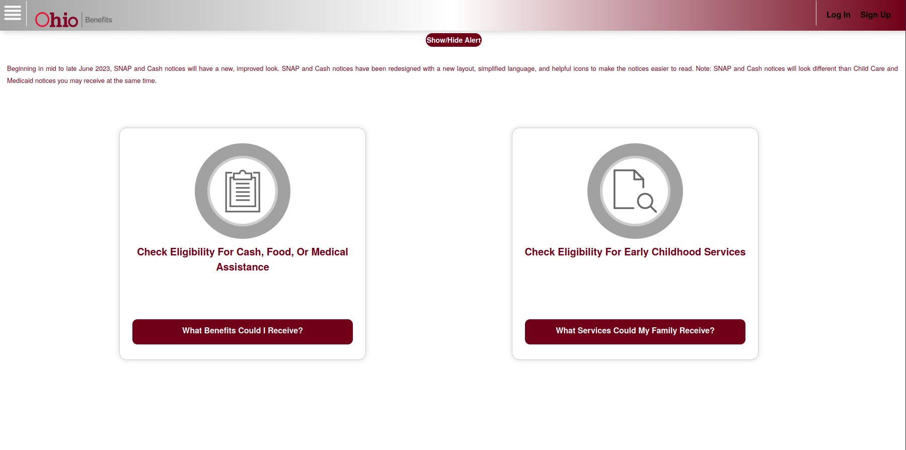
- Whitespace. Whitespace should be consistent. The homepage has too much whitespace in between each page category, keeping the bottom two links hidden and easily unnoticed. Similarly, related content should be grouped in proximity. [specification]
- Redundant language. The hamburger menu title reads "Useful Links", implying that non-useful links exist. Redundant language should be replaced with language that provides value, or omitted entirely.
- Dead links. The hamburger menu contains a "Help" link that does not perform any action or route to a new page. This is a dead link and should be updated or removed.
Performance
- Unnecessary redirect. The "Show/Hide Alert" button unnecessarily refreshes the entire page to toggle notice text. This can cause performance issues for slower mobile devices. I recommend hiding the element via JavaScript.
- Quirks/Almost Standards Mode. The site does not declare a doctype which defaults to using quirks mode for compatibility with Navigator 4 and Internet Explorer 5. Declare
<!doctype html>at the top of your pages to use modern browser rendering and behavior. [specification] - HTTP/1.1.
HTTP/1.1is an outdated protocol and should be replaced withHTTP/2orHTTP/3for significantly reduced latency. I recommend using Google's Lighthouse for refined performance insights. [specification] - Minification. All text assets (CSS, JS, HTML) should be minified to reduce client memory usage and network overhead. I recommend using a public tool such as Minifier.com.
Accessibility
- Color contrast. Widely accepted color contrast for maximum accessibility is WCAG Level AAA conformance. This site's header has "Log In" and "Sign Up" buttons that do not even meet Level A conformance with a color contrast of
2.17:1. I recommend using WebAIM's contrast checker for testing color contrast. [specification]
Additional Notes
- Duplicate identifiers. The site employs duplicate identifiers such as "CUSTOMMODALRIGHTBUTTON". Identifiers should be unique and can lead to unpredictable behavior if duplicated. I recommend using the official W3 validator to validate markup. [specification]
- Input validation. Some input fields throughout the site do not filter invalid values on the client. For example, the zip code input on the Office Location and Hours page accepts non-numeric values, when it should be restricted by the site. I recommend using the
patterninput attribute for automatic client validation, which is supported by all major browsers. [specification]
Conclusion
This was only a brief glimpse into the Medicaid website. I am hopeful that employees of the Ohio government will see this and take action to make these benefits more accessible for all. On an optimistic note, if you're reading this, I am more than happy to volunteer my time to improve this service.